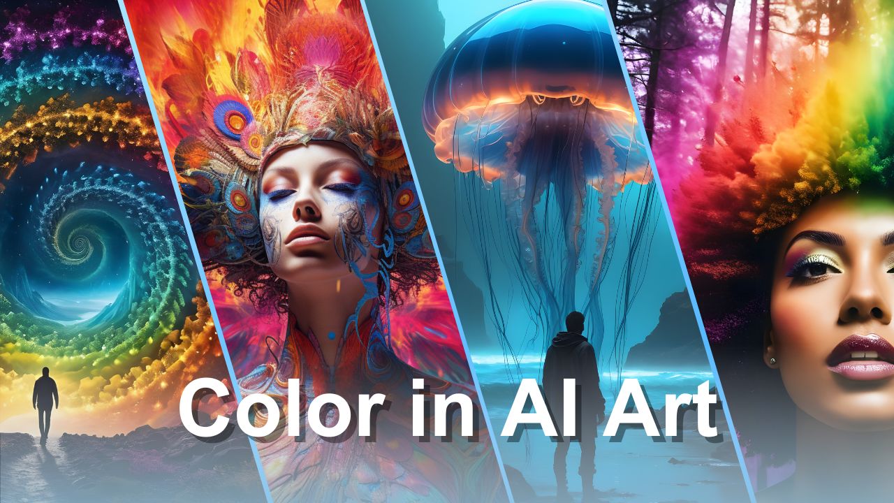
Color in AI art is a powerful tool that can transform your creations. From setting the mood to creating stunning visual effects, the right use of color can make all the difference. In this article, we'll dive into how AI understands and uses color, focusing on prompting colors, modifying color labels, and much more.
Let’s explore how you can use these techniques to make your AI artwork even more impressive!
HEX Codes in AI Art
In traditional graphic design, HEX and RGB codes are essential for targeting exact color hues. For example, the hex code #ffa500 corresponds to orange, and #8b0000 represents dark red.
However, AI image generators don't work this way. They are natural language tools, meaning they understand and respond to color prompts given in everyday language rather than numeric codes. Instead of specifying a hex code, you can simply prompt the AI with color names.
For instance, asking for "purple" or "sky blue" will instruct the AI to incorporate these hues into your artwork. This approach makes it accessible, allowing even those without technical knowledge of hex codes to create visually appealing images.
How to Prompt Colors in AI?
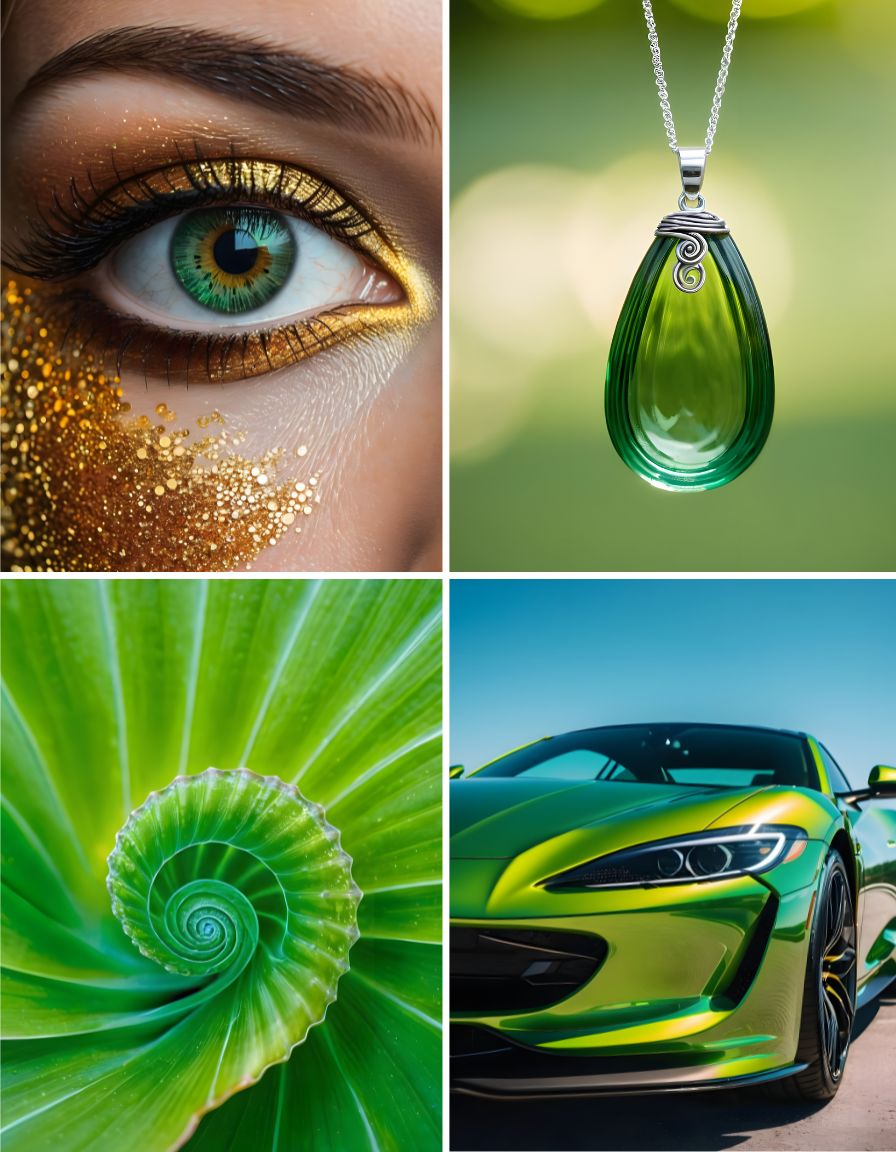
When using AI image generators, you can prompt colors by name. Starting with basic colors like red, orange, yellow, green, blue, indigo, and violet, you can create a wide range of images. However, don’t stop there. AI tools recognize hundreds of color names, offering a rich palette for your artwork.
For example, instead of just prompting "blue," you can specify "royal blue," "cyan," or "cerulean." While the AI-generated color might not match the exact hex code, it will be in the right ballpark.

The AI also adds complementary colors and shades to make the image more interesting. It interprets color names based on context. If you prompt "lavender," the AI might include a lavender plant. To ensure clarity, use specific phrases like "lavender-colored house" to guide the AI accurately.
Modifying Color Labels
Beyond basic colors, you can modify color prompts to achieve the desired effect. Terms like "light," "dark," "vivid," "deep," "neon," "saturated," "muted," and "shiny" change the hue and intensity of the color. These modifiers help the AI generate the exact mood and effect you want.
For example, "transparent green" is not just a color but an effect that affects the material and lighting in your image. Similarly, "glossy green" and "opalescent green" will result in different surface textures and appearances. Using such specific modifiers allows for more nuanced and sophisticated AI art.
Color Terms
Color in AI art isn’t limited to single hues. You can ask for a mix, blend, or swirl of colors. These options open up endless possibilities! There are many words to describe color. You can prompt for a hue, tint, shade, or pigment. The AI understands a wide range of natural language references to color.
For instance, ask for a spectrum or palette of colors. Requesting a colorful or multi-colored image, a rainbow effect, or prismatic images can yield vibrant results.
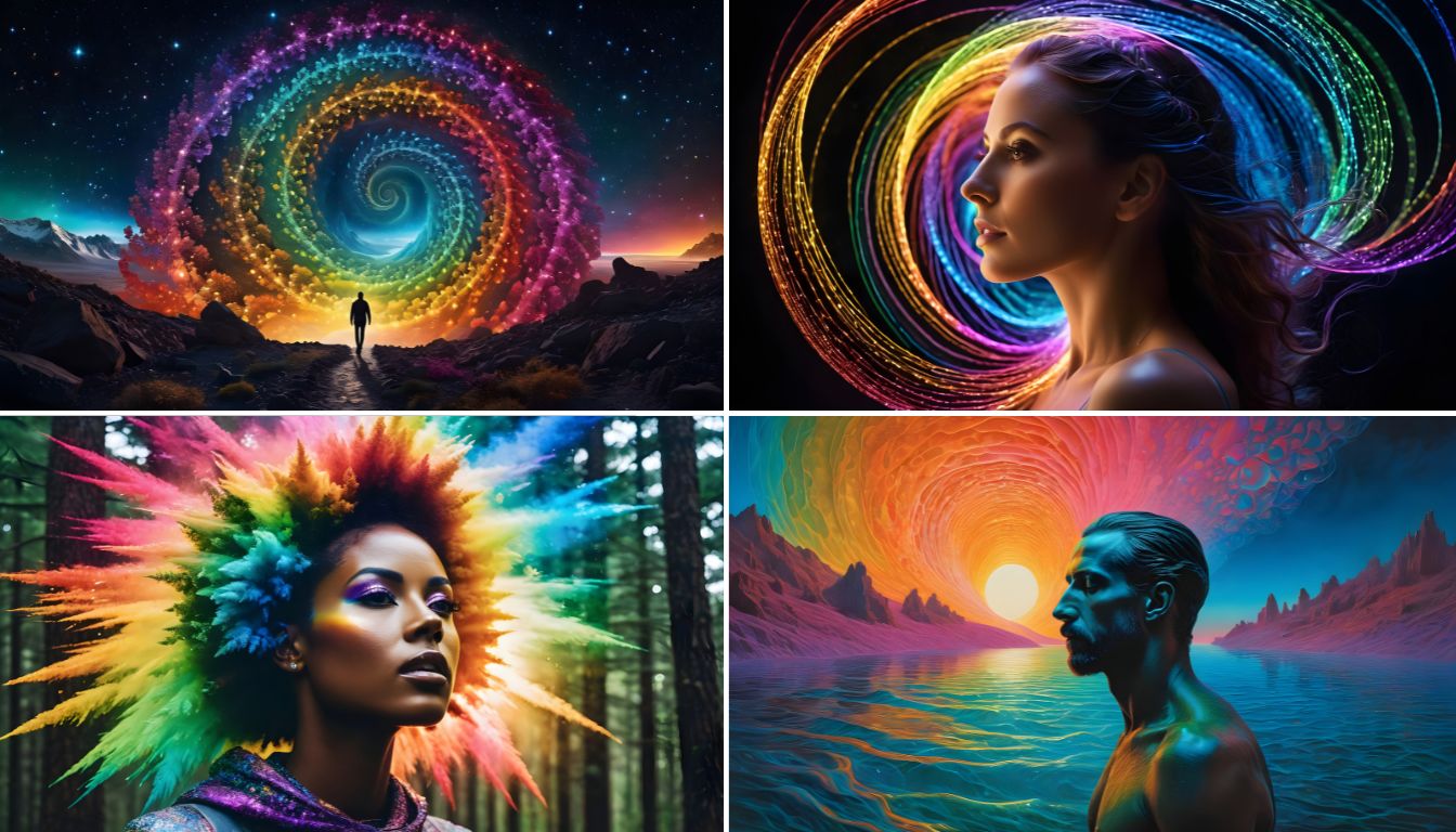
Words like duotone (two colors), tritone (three colors), and quadtone (four colors) help you create complex, layered visuals.
Monochrome or grayscale will give you black-and-white images, while selective color or color pop highlights a single color in a black-and-white image. Terms like ombre (gradual shading) and variegated (patterned) offer even more ways to combine colors.
Blending Colors
When artists and designers talk about color combinations, they often refer to color palettes. Combining colors involves understanding how different hues interact and complement each other. This brings us to the next essential concept: color theory.
Color Theory
Color theory is a guide for artists and designers to choose colors that go well together. It’s based on the color wheel, a circular diagram of colors.
Here are some basic concepts:
- Complementary Colors: These colors are opposite each other on the color wheel, like blue and yellow. Placing them next to each other creates strong contrast, making both colors appear brighter and more vibrant. This technique is often used in graphic design to add depth and interest.
- Analogous Colors: These are colors next to each other on the color wheel, like red and orange. They share common properties and create a visually cohesive look. However, too many similar colors can look monotonous, so adding a contrasting color can make the design more dynamic.
- Split Complementary: This involves three colors—one base color and two adjacent to its complementary color. It balances a cohesive color scheme with a contrasting pop, making the design harmonious and visually interesting.
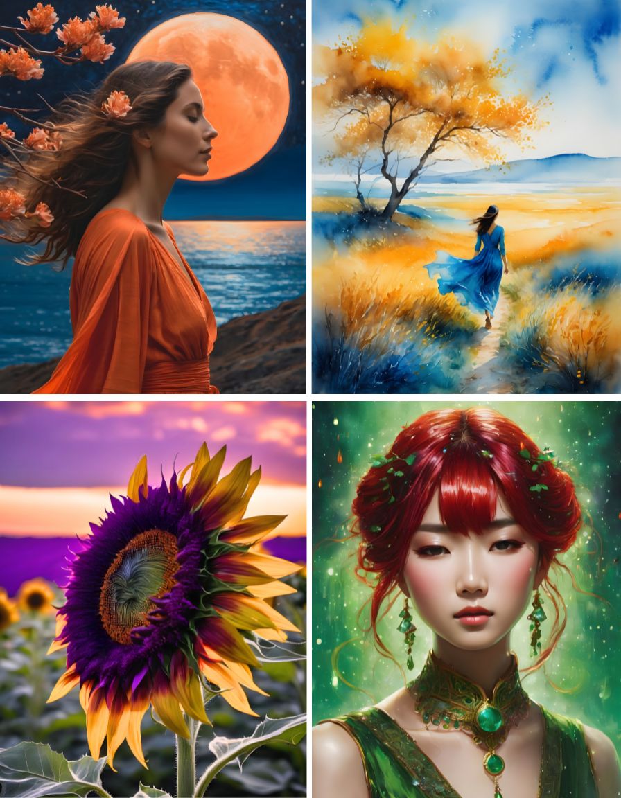
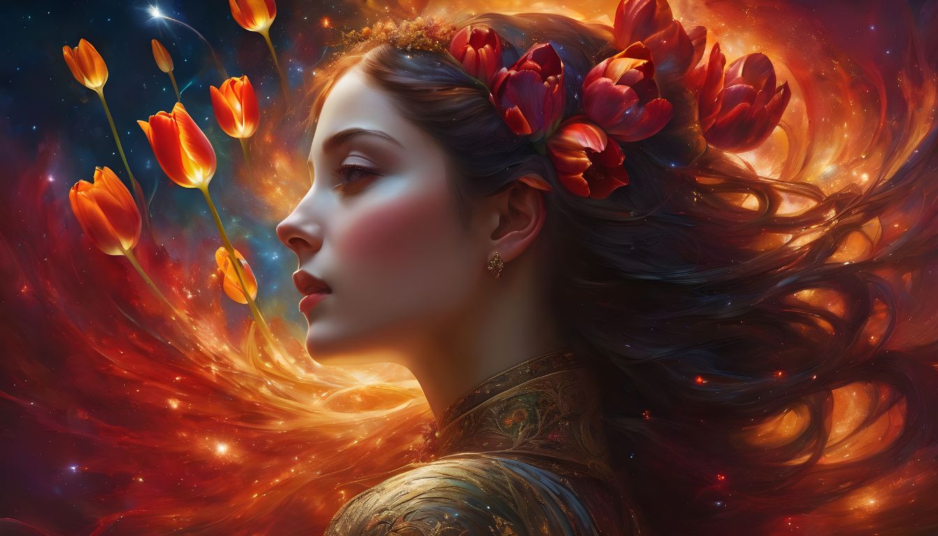
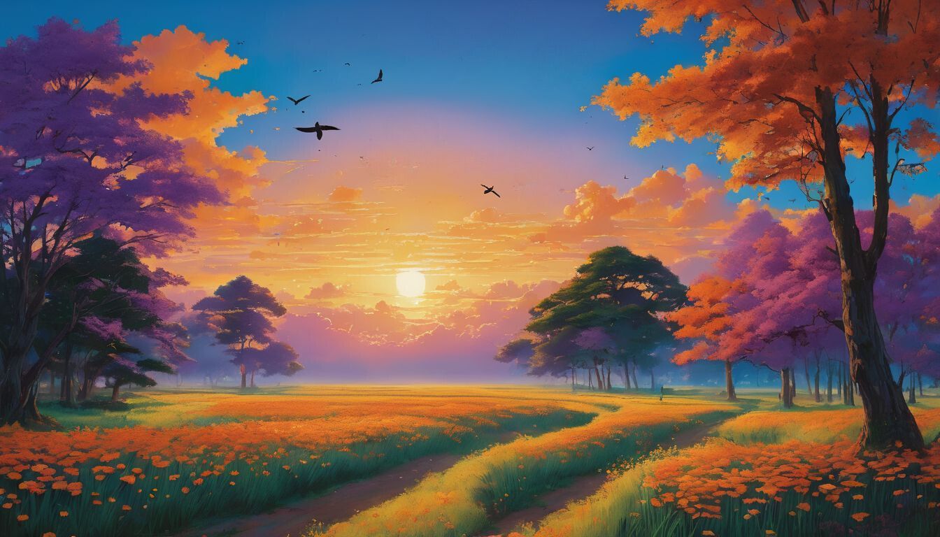
Image Description
- Image Background: A serene blue sky with wispy clouds, representing the dominant base color.
- Main Subject: A majestic orange and yellow sunset on the horizon, contrasting beautifully with the blue sky.
- Accent Color 1 (Adjacent to Complementary): Lush green trees lining the horizon, complementing the orange hues of the sunset.
- Accent Color 2 (Adjacent to Complementary): A flock of birds flying across the sky, displaying shades of violet and purple, enhancing the contrast with the blue backdrop.
When it comes to AI art, color plays a vital role in setting the mood of your images. While asking an AI image generator for complementary or analogous colors can be helpful, the results may not always be precise.
To get color suggestions tailored to a specific mood, simply ask the AI for an "autumn color palette" or a "melancholy color palette."
The AI will provide you with some color suggestions to kickstart your creative process. From there, you can explore further!
Using Color as an Image Prompt
When prompting the AI, don't forget to incorporate images as part of your prompt. Showing the AI exactly what you want can help ensure more accurate results.
In Conclusion: Colors in AI Art
Colors are inherently visually interesting, and leveraging them effectively can elevate the impact of your AI creations. The colors of the rainbow are captivating but don't limit yourself to just those hues. Explore a vast spectrum of colors and combinations!
Mastering the use of color in AI art opens up a world of creative possibilities. By understanding color theory, utilizing color prompts effectively, and experimenting with different palettes, you can create visually stunning and emotionally engaging artworks that captivate viewers' attention.
So, get on your colorful journey of creating AI art today. Let your imagination soar!